Monday, 24 November 2008

My trip to a plastic recycling factory.


I travelled to Bradford to a plastic recycling factory to take my very own pictures to work from, i really enjoyed this :) i learnt lots more things about plastic recycling, from my tour. I like the idea of going out taking my own photographs and then working from them, i choose to use more industrial photographs on my mail shot as, it opens to a wider range of people and the large capacity of plastic we use i show more in these images than the personal ways of recycling.


Sunday, 23 November 2008

No news is good news

I enjoyed this project.. this is the result from my photographs, it took me absolutely forever i actually had no life during this project, but i feel the result shows this :) especially as everyone was shocked it was hand drawn.

recycle centers and tips and random rubbish bins ...


These are a few more, i have lots and lots of varieties but it will get boring if i show you them all :)

more what is GREEN pictures :)


I am trying to show being 'green' through cycling rather than driving a car.... as you can see with the added hint of the green hat and dress... it was freezing and i made my sister wear summer clothes, so kind! as you can see, she wasn't a very good actress an these photos look a bit erm rubbish shall i say!

Monday, 10 November 2008

Visual Metonym


 Abslout Vodka

A visual metonym is a symbolic image that is used to make reference to something with more literal meaning.

In this advert the beverage is substituted by the bottle. The metonym in this advert is the association to the city of Geneva with the Swiss watch, from which the bottle is a piece.

Visual Metaphore


French Aids Campaign.

A visual metaphor is used to transfer the meaning from one image to another.

Wednesday, 5 November 2008

Bonfire night!

Fun times with sparklers!

What is GREEN?


I choose to represent the colour green through recycling, i visited many areas which had different methods of recycling, such as a recycling centre. Above are just 3 of my final photographs.


Alphabet Soup


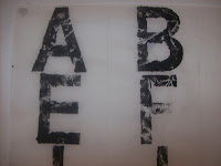
The brief was to create a full alphabet based on my partners personality/character. My partner was Paul Mitchell, i based my font type around 

the words, indecisive, doubtful, held back and reserved. I wanted to create a letter form that held back and had areas of the font missing. I experimented with different materials to create this, the end resulting in a leaf, black paint and ink. 

Ovals and Stars

A workshop where i had to create the alphabet using only black and white and with the shapes ovals and stars. Each letter had to have both shapes in?! it tooook ages but the over all affect looks quite good, not the best pieces of work but there ya go!

Print Typeface


Love Print times! 

Type Face


This is my type face based on the word 'exaggerate' i really enjoyed this as it was my first bit of work iv ever don on typography.. properly.. the pictures not very good so i will post another when i go on at uni :) It looks much better close up and in life promise promise.

Complementary Colours


Sunday, 2 November 2008

Colour Day with greeeeen!


Lots and lots of colour's of green, but which is the most green? hmm confusing. These are all the different shades of green the 'green' group brought in :)